Thursday
Jan222009
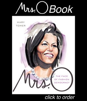
One New Look Deserves Another
As Mrs. O moves into the White House this week, we thought we'd mark the occasion with a brand new logo. We hope you like it.
in  Outfits
Outfits
Reader Comments (54)
I liked the old one better.
I find the new logo really problematic. The "O" just doesn't stand out from the preceding lower case letters. There's a disconnect between the way the name of your blog is pronounce--with the accent on the "O"--and the way it appears.
Also, this logo is somewhat fluid, rather than bold and striking. Michelle is bold and action-oriented, so the flowing style of this logo doesn't fit her personality.
Really, consider changing it back.
Loved the original logo!! It popped so much more than this new one does... this logo has no oomph!
I discovered this blog around election day, but never posted. I enjoy it here, and that's big deal b/c I am NOT usually a blog kinda person. However, this blog has a great, positive, mature vibe. Nowhere as much toxicity that seems to fester on most blogs.
Lady G, I will be stopping by Barney's to have a gander at the window. Thx for the heads up! :p
Oh, the logo lol. This one's fine, but the previous one was better.